TeamSpark is a modern, fully responsive landing page built to promote a fictional remote collaboration platform. Inspired by real-world SaaS sites, this project was developed as a design-to-code challenge with an emphasis on clean UI, accessibility, and high performance. The goal was to create a marketing page that would look great on all devices, load fast, and meet professional accessibility standards – all without relying on heavyweight frameworks or CMS tools.
14 min read

🧩The Challenge
Create a lightweight marketing site for a fictional SaaS product - TeamSpark:
The challenge was to build a responsive, accessible landing page that could effectively promote a fictional product – TeamSpark – as if it were a real SaaS startup. The project needed to look polished on both mobile and desktop, follow accessibility standards, and load quickly without the use of complex frameworks or pre-built themes. A secondary goal was to approach the project as a professional client-facing build -organizing code clearly, optimizing performance, and preparing the site for future scalability or reuse as a freelance template.
🧠My Approach
I started by looking at the layout and visual structure based on a Figma mock-up I made using AI. I went for semantic HTML and mobile-first design, using CSS custom properties (variables) and a BEM-style class naming approach so the code is scalable and maintainable. For styling I kept it super lightweight with vanilla CSS, using flexbox and grid to build responsive layouts. Media queries were added to progressively enhance the design for tablets and desktops. All animations were done with transform and opacity to avoid layout shifts and improve performance. On mobile and tablet views I disabled these animations entirely for a smooth glitch free experience. Accessibility was built in from the start — I added ARIA roles, keyboard navigation support, focus styles, skip links and proper image alt descriptions. Navigation is accessible by screen reader and keyboard, and I used semantic tags (<`header`>, <`main`>, <`section`>, <`footer`>) to structure the page. JavaScript was added in small modular scripts — mainly for menu toggle and scroll based behaviour. I avoided unnecessary libraries to keep it fast and in control.
🧪Build Highlights
The site was built from scratch using HTML5, vanilla CSS, and JavaScript — with an emphasis on clean, readable code and progressive enhancement.
-
Navigation
- Built using semantic <`nav> and accessible <`button> elements for the mobile menu toggle.
- Menu state is toggled with a custom JavaScript function that swaps SVG icons and slides the nav in/out.
- The active link is dynamically tracked with aria-current="true" using a scroll position check, improving screen reader navigation.
-
Hero Section
- Uses a background image with an overlay filter and headline text layered via position: absolute.
- Responsive typography ensures that the content remains readable across screen sizes.
- Call-to-action button scrolls to the contact section with smooth behavior.
-
Features section
- Built using flexbox and wrap to allow for adaptive layout across devices.
- Each feature uses a reusable card format with SVG icons and animations that fade in on scroll (desktop only).
- Accessibility roles and aria attributes provide context for screen readers.
-
Team section
- A responsive grid layout (grid-template-columns: repeat(auto-fit, minmax(...))) displays team members cleanly on all devices.
- Each team member card includes name, title, avatar image with alt text, and links to LinkedIn or a portfolio site.
- Team members are described with schema.org/Person structured data inside the Organization block for SEO.
-
CTA Section
- A minimal, two-line CTA section with a centred button.
- Uses a subtle hover animation and mobile-friendly full-width layout when needed.
-
Footer Section
- Semantic
- Social icons were converted to inline SVGs for performance and styled with CSS :hover and fill transitions.
- Copyright info and social links include accessible aria-labels.
-
JavaScript Features
- Toggle navigation menu visibility and icons on small screens.
- Add shadow class to header when scrolling past a threshold.
- Animate elements on scroll (desktop only).
- Blur focus from buttons after mouse interaction to avoid lingering outlines.
📈Performace
TeamSpark was optimized with a focus on real-world performance and best practices — not just to score high in Lighthouse, but to deliver a fast, accessible experience for all users, including those on mobile networks or lower-end devices.
-
Performance
- Images were compressed and lazy-loaded (loading="lazy"), reducing initial page load time.
- Font Awesome was replaced with inline SVGs to cut external dependencies.
- CSS and JavaScript files were minified, and caching was set via a _headers file on Netlify.
- Animations were hardware-accelerated using transform and opacity, and disabled on mobile for smoother scrolling.
-
Lighthouse Score
- Performance: 99
- Accessibility: 92
- Best Practices: 100
- SEO: 100
-
SEO Optimization
- Included semantic structure with <`header>, <`nav>, <`main>, and <`footer> for crawlers.
- Proper use of <`title>, <`meta name="description">, and social sharing meta tags (Open Graph + Twitter).
- Added canonical link to avoid duplicate indexing.
- Implemented robots.txt and sitemap.xml for crawler guidance.
- Indexed and tested in Google Search Console.
-
Structured Data (Schema.org)
- Used Organization, Person, and ItemList schemas via JSON-LD.
- Tells search engines exactly what TeamSpark is, who the team is, and what features it offers.
- Improves rich result eligibility and builds brand authority in search engines.
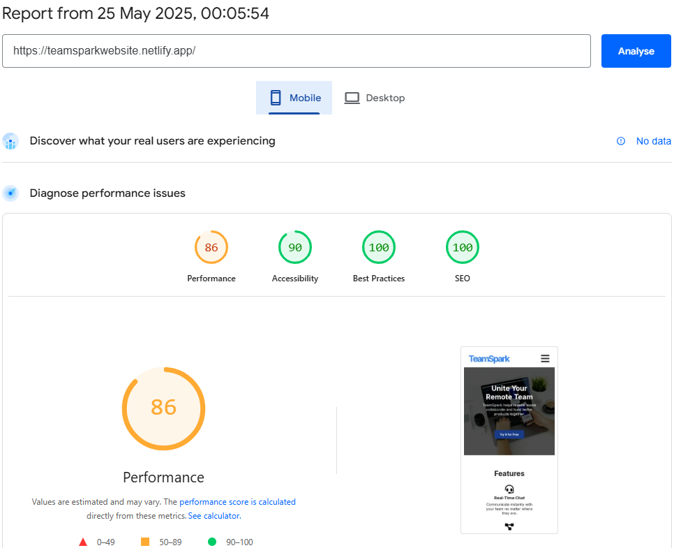
Featuring Lighthouse records captured upon project completion on the 26 May 2025. Click the "Records" link to view all records.
💡Lessons Learned
Building TeamSpark was more than just another coding exercise — it was a deep dive into
what it takes to ship a
polished, professional-grade frontend project from scratch.
Here's what I walked away with:
-
Deeper Understanding of Accessibility
- I learned how to implement ARIA attributes like aria-current and roles like navigation, banner, and contentinfo.
- I now understand how keyboard navigation, screen readers, and focus indicators work together to create an inclusive experience.
- Accessibility isn't a checklist — it's a mindset.
-
Stronger Frontend Architecture Skills
- I organized code using reusable classes, CSS variables, and a clean folder structure that scales.
- Working without a framework pushed me to sharpen my vanilla JavaScript and CSS layout skills (flex, grid, responsive breakpoints).
-
Perfomance Optimization Tactics
- Minification, lazy loading, and prefers-reduced-motion taught me how to balance visual polish with load speed and stability.
- I discovered the real-world impact of replacing external libraries (like Font Awesome) with inline SVGs.
-
Practical SEO and Structured Data
- I learned how to speak “Google’s language” by writing structured JSON-LD for Organization, Person, and ItemList schema.
- I now understand how tools like Google Search Console, PageSpeed Insights, and Rich Results Test play together.
Most importantly, I built a system I’d be proud to show a real client or employer. I now have a process — from concept to deployment — that I can reuse and scale.
🔗Resources
TeamSpark is now deployed and available as a live demo. You can view the site in action, explore the source code on GitHub, or fork the project to build on top of it.
Live Demo GitHub Repository Lighthouse Report: For Desktop Lighthouse Report: For Mobile
Final Thoughts
TeamSpark has become a foundational piece in my portfolio — a place where I’ve tested and refined my skills in HTML, CSS, accessibility, performance optimization, and clean UI design. It represents not just the ability to build something functional and beautiful, but also to do it in a way that’s inclusive, scalable, and search engine–friendly